Showing posts with label pattern. Show all posts

Tuesday, February 11, 2014

Pattern Find - Betty & Walter

Sometimes my passion for pattern can be difficult to live with, I'll spot an amazing pattern on a dress across the street or a handbag in a supermarket but never know who made it or where it came from. The latter happened the other day, I spotted an amazing handbag but I didn't want to interrupt the lady doing her shopping to ask where it was from. Then by chance a picture came up on Instagram and it was a small purse in the same print, at last I found out who made it! I was overjoyed to finally find out!

It turns out the bag is made by Betty & Walter, a lifestyle brand with patterns by Lisa Levis, seen below!
 

Isn't it gorgeous?! The pattern is called Sgt. Pepper, a 60's inspired print, with a bold colourful floral blooms. There are other products in the pattern shown below, only problem is now I want them all! 


Tuesday, February 26, 2013

New design - Ideal Homes Wallpapered Competition

Today I am sharing a new design I created recently for the Ideal Homes Wallpapered Competition.


As the print is designed for wallpaper it works best at a large scale where you can see all the detail and texture


I'm really pleased with this design and would love to actually have it as wallpaper! I hope to have it available as wallpaper (perhaps through Spoonflower) in the future!

Images copyright Rosie Simons 2013

Thursday, February 7, 2013

Guest Post from Decorque - Upcoming Trend: Toile du Jouy

Hello all! We are delighted to be guest blogging on the wonderful Rosie Simons blog today, and thought we’d share with you a surface pattern trend that has been with us for centuries, but is making it’s way back into certain elements of design, Toiles!

A toile is a fabric with detailed figural and scenic designs, usually in a monochromatic colour scheme. The word Toile means "cloth" and Jouy refers to the village near Versailles where most of the famous French toiles were produced. Hardly any of the designs were original as they were taken from books and engravings. They really are a "picture story" on fabric, giving us a glimpse into the life of the time.

Today we have brought them to life again, not only giving the old designs a fresh new look and use, but designing our own showing twenty first century city scenes and landmarks. The distinctive toile prints of Timorous Beasties, include London scenes with the now iconic Gherkin Building and less prominent Tower Bridge, all available on wallpaper and fabric. I think the monochrome colours work to the toile's advantage, making it versatile, and easy to coordinate into modern life, and the constant changing colour schemes of fashion.


It is interesting to see, how they are being used on all manner of media nowadays, from wellies to lampshades and stationery on Society6. My personal favourite is the way Anthropologie have mixed the toile design with a bold, graphic edge of colour to make modern crockery. Even Spoonflower held a competition last month to submit a Murder Mystery Toile – some of the designs were amazing, and our moodboard features the winner’s design, entitled Toile Noir by Marnie Long and shows scenes of Paris in black and cream.

Interestingly, there are several pre-Decorque toiles that were designed a few years ago by our Head Designer Lesley Stevens that we thought illustrate how a toile can be interpreted in a modern way! The grey toile is a typical business workday in a city. A plane, a train commute, the walk to work, a meeting in the office and a break in the park. All everyday events or occurrences. This was designed as a wallpaper backdrop for a retail men's department to promote the typical formal business suit. Another modern twist was to use animals in their habitat, underwater scenes and an owl in its wildlife setting, giving the over all effect of a toile but with less formal subjects.


Decorque says pattern!

From the quintessentially English roses and birds to the exotic parrots, toucans and hummingbirds. Mixing the hand drawn and painted with Illustrator and Photoshop we like to think we bring something new - a creative touch - to our home-ware products.

The main collection is our range of cork placemats, table mats and coasters. What makes us different? We print digitally on cork, which is the only successful way of producing the highly detailed pattern and extensive colour palette of our own unique designs. The end product is amazing, carefully crafted to retain the warm tactile quality and natural appearance of the cork. It is eco-friendly, hard wearing, heat resistant and just such a practical natural product, read more here, Why Cork?

We love the idea of not just printing on cork but using it as an element of design throughout our other ranges of art prints and stationery. From being printed on cork, to cork being printed on paper!

If you haven't guessed yet, our name comes from a fusion of the words Decor and Cork, but with a twist - Corque.

Blog // Website // Twitter // Facebook // Pinterest // Etsy // Folksy

Wednesday, January 30, 2013

Colour & Pattern Inspiration from Jnr Joules

I was browsing the Joules website and came across this lovely floral pattern on some of the Jnr Joules girlswear.

The print has lovely texture and even features colour of the year, Emerald!


Images sourced from joules.com · Top · Sweater  · Dress 

Collage image copyright Rosie Simons 2013

Monday, December 10, 2012

west elm

I've discovered lots of fantastic places whilst here in NYC, one place I'd always heard people talk about but never visited was west elm. If you've never heard of it before west elm is a contemporary furniture and homewares retailer. They sell gorgeous furniture and accessories, I spent ages in the shop taking in all the different textures, patterns and prints!

Below are some pictures of a few things I picked up, some cute little candles, an owl candle and a decoupage glass tray. Everything is so well designed and there are so many wonderful colours and patterns!


I fell in love with these bright hand painted style patterns and was so pleased when I picked up the free paper in store to find a section all about the designer, Sarah Campbell.


Even their free newspaper is just beautiful! I would just love to work for west elm, creating patterns or working on graphic design, everything is just so gorgeous and wonderfully produced!


Do check out their website westelm.com, and for more you can follow @westelm on twitter, like west elm on facebook or for even more, and overwhelming amounts of gorgeous inspiration you can follow west elm on pinterest! Or better still visit one of their stores!


Images copyright Rosie Simons 2012 - Content copyright west elm

Monday, November 26, 2012

Spoonflower Matisse/Nasher

This weeks Spoonflower contest was run in conjunction with The Nasher Museum of Art at Duke University and the brief was to create a design that would look at home in a Matisse painting. The colour palette was specified, with some really lovely colours so I couldn't help but take part!

Below is my entry, you can vote on the Spoonflower website here!


Images copyright Rosie Simons 2012

Friday, November 23, 2012

Feature Friday - Kate Marsden

Today I bring you the fourth 'Feature Friday'

Today our featured designer is..

Kate Marsden

Kate talks us through her story, passions and plans for the future..


"I studied fashion and textiles at Lincoln College of Art & Design in the mid 1990s, then followed my now husband to London and ended up working for a law firm!  I'm still there 14 years later, but I realised a few years ago that I needed an outlet for my creativity.  I kickstarted this with a short course at Chelsea College of Art, and I've now taken a number of short courses there in textiles, painting and ceramics." 


"My real passion is surface pattern design, but I also like to knit and took up crochet earlier this year.  I use my paintings and sketches to create pattern designs and translate these into designs for ceramics, cross stitch and all sorts of different things.  I've recently opened a shop on Folksy."  


"At the moment I'm working on some new fabric designs which I hope to launch in the new year, and I'm also preparing to launch my website." 


"I'm constantly inspired by things I see around me.  I particularly like the styles of the 1950s in fashion, textile and print design as well as architecture.  Sometimes I'll spot something on the street, or it'll be an exhibition or something in a magazine that gets me started on something new."


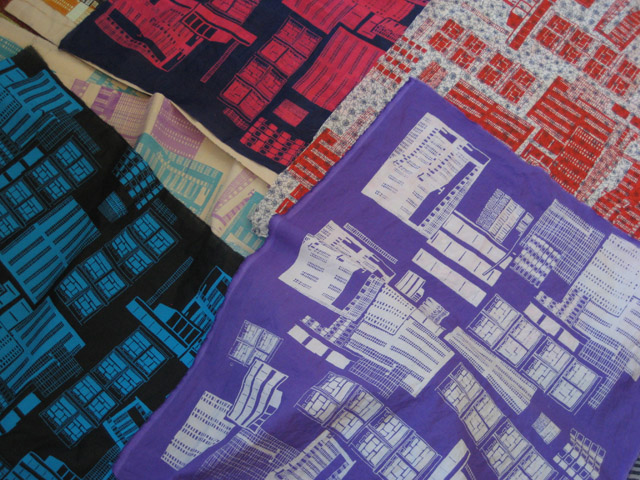
"With regard to my creative process, I generally start with my photographs and make sketches based on them before creating paintings (usually acrylics, occasionally watercolour).  I will then turn my painting into a repeat pattern on the computer.  My 50s City design was just drawn, photocopied and pieced together (although I still worked from my earlier paintings initially). 50s City was screen printed, whereas Park Hill was digitally printed."


Twitter: @kdmarsden
Blog: http://www.kate-7ws.blogspot.co.uk
Folksy: http://www.folksy.com/shops/MadeByMrsM

Images copyright Kate Marsden

Thursday, November 22, 2012

Society6 introduce throw pillows

Society6 have just introduced throw pillows! So you can now buy my designs as cushion covers from my store! Society6 are also doing free shipping from now until Monday so why not pick up some Christmas presents? 


Images copyright Rosie Simons 2012

Friday, November 16, 2012

Feature Friday - Chloe Wood


Today I bring you the third 'Feature Friday'

I hope you're getting into a routine now knowing you can visit the blog on Friday's for wonderful showcases of very talented designers work!

Today our featured designer is..


Chloe talks us through her passions, inspirations and plans for the future..

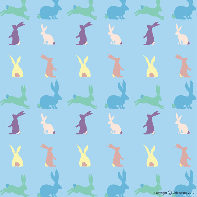
"I  love to draw Flora and Fauna. The majority of my designs are inspired by this subject, however I have a whole range of designs I am yet to create all based on my travels around the world (so many ideas never enough time!)."


"I usually start off by just doodling and scan my drawings into Photoshop I then like to play around with scale and formats until I am happy with the design and then recolour them. I have recently started the ABSPD course as I want to develop my skills and design brand further"


"My style is a little naive but I love using my own handwriting it is what makes my designs unique to me."


"I am currently open for commissioned work so if anyone is interested please feel free to contact me via my website."


You can get in touch or view more of Chloe's work via:


All images copyright Chloe Wood 2012

Thursday, November 15, 2012

Pattern Inspiration - John Lewis Girl

I spotted this cute little dress whilst browsing the John Lewis website.. I was instantly drawn to the wonderful colour palette and the brushstroke style floral pattern.

It's just full of inspiration and really gets my creative juices flowing so I thought I would share it with you all!

You can view the dress online on the John Lewis website here


Images source: John Lewis

Wednesday, November 14, 2012

Spoonflower

This week I entered Spoonflower's Holiday Napkin Contest..

I wanted to create something fun and festive, so I chose bright versions of classic 'holiday' colours and combined them with contemporary Illustrations of classic holiday icons and 'happy holidays' caption in a playful typeface. 

You can vote HERE!


The only instructions for the competition were 'Using a fat quarter (21" x 18") of fabric as your canvas, create a set of holiday-themed cocktail napkins. We suggest setting them up sized at 4.5" x 4.5" inches, with an additional quarter inch on each side to be used as a seam allowance (making each square 5" x 5")' so you were free to play with different ideas and layouts of the design.. I chose to go patterned!


All images copyright Rosie Simons 2012

Monday, November 12, 2012

Website Update

Last week I spent 3 solid days updating my website.. the site needed a bit of freshen up with new work, new pages and a better user experience. I am really pleased with how it looks and hope you all like it too!

You can visit the site yourself at rosiesimons.co.uk


All images copyright Rosie Simons 2012

Friday, November 9, 2012

Feature Friday - Lauren Cherice Designs

Today I bring you the second instalment of our new feature.. Feature Friday.

Today our featured designer is..

Lauren Cherice Designs


Lauren Cherice is a Surface Designer currently based in the East Riding of Yorkshire. Graduating from Cleveland College of Art and Design in 2011 with First Class Honors in a BA(Hons) Textiles and Surface Design, Lauren specialises in producing furnishing fabrics and accessories by traditionally screen printing her designs from home.


Inspired by natural flora and fauna, she uses her own photography to help her produce beautiful contemporary detailed drawings. The use of pen, ink and other mix media allow her to create several layers within her artwork to give her pieces subtle depth that develops through into her prints.


Since graduating Lauren has completed a two month internship at Christopher Farr, London and in 2010 completed a two month internship with Timorous Beasties, Glasgow. Both experiences have driven her to pursue her career in design by providing her with the vital knowledge of the design industry.


Lauren says: "After finishing university I was unsure what direction to take but knew I didn't want to end my love of screen printing and drawing. After returning from my internship in London it made me feel inspired and motivated to start my own business as Lauren Cherice Designs."


Lauren's work is currently exhibiting in her home town of Bridlington at The Alex May Gallery, Old Town through to December.


Stockists of her hand printed tote bags are available in Behind The Times, Bridlington and The Folio, Hartlepool. She will also be a stall holder at Designers Marketplace at Middlesbrough Town Hall on the 15th December.


You can follow Lauren's work on:

Twitter: @LaurenCherice

All Images Copyright to Lauren Cherice Designs